Greg Wright Architects
2026
Giving legacy a more recognisable form
GWA is a Cape Town architecture studio with more than 30 years of work across residential, commercial and public spaces.

Insight
The value was already in the name
Greg wanted the brand to carry the same sense of authorship as the buildings themselves, a mark whose presence added value rather than simply identifying the practice. Instead of following the architectural convention of acronym-led identities, we focused on the one element with decades of equity already behind it: Greg.

Concept
Craft, reduced to a single mark
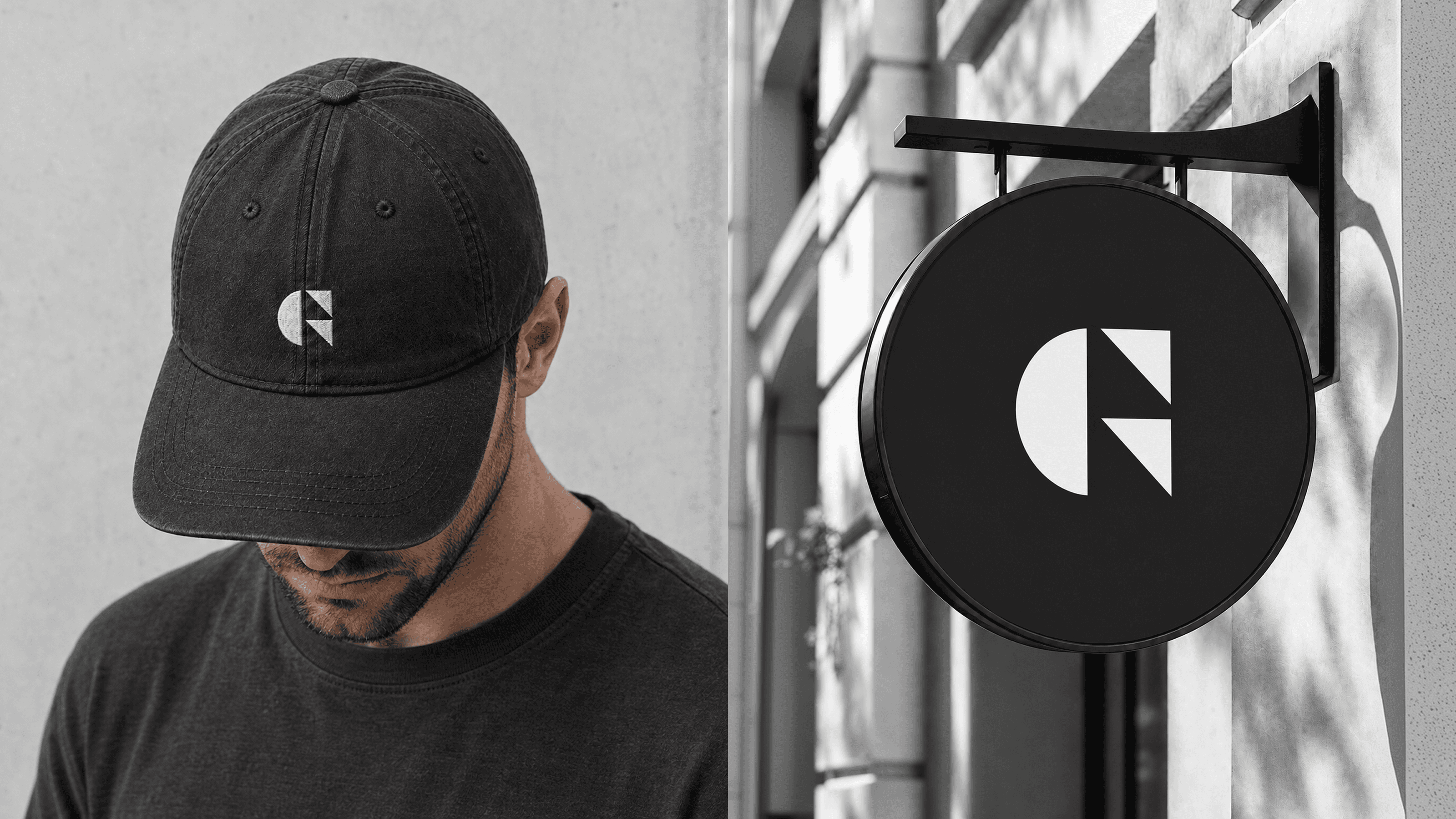
The identity was distilled into a singular G, constructed from simple geometric forms. A curved form references the organic world that influences Greg’s work, while precise triangular elements reflect his constant pursuit of refinement and perfection. The result feels part architectural symbol, part editorial monogram.




Identity
Precision with room to breathe
The wider system balances architectural discipline with creative expression. Generous white space and grid-led layouts create a sense of consideration, while a more saturated evolution of the studio’s existing blue preserves continuity. Fine tapered lines, technical drawing references and geometric motifs introduce the craft and precision behind the work.


Expression
A framework for the work
The identity becomes a restrained framework rather than competing with the architecture itself. The system gives GWA a clear, consistent presence while allowing the buildings, materials and details of the work to remain the focus.


